 OUTFIT
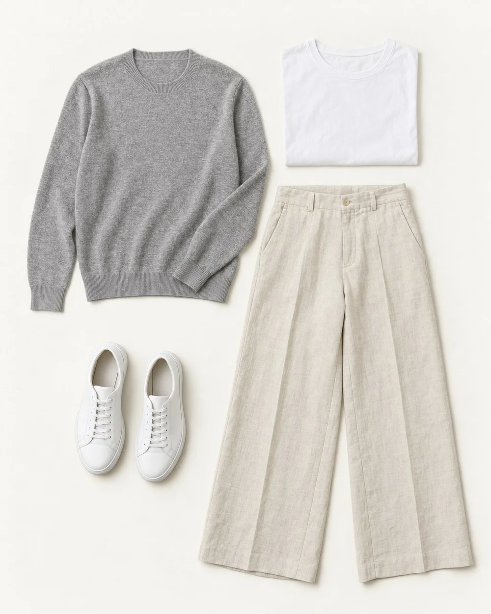
A useful color pairing has to work with the garments you own, not just with two swatches on a screen. Fabric texture, pattern, the size of each colored area, and the layers you add all change the result. This approach helps you build an outfit today rather than redesign your entire wardrobe palette.
Begin with one real garment, not an abstract rule
Choose a piece with a color you want to use more often. Put it beside actual tops, bottoms, or layers from your closet. A green skirt might look quite different with an ivory cotton shirt, a navy knit, or a pink blouse, even though all three are plausible combinations.
Check the pieces in similar light. Photographs and screens can alter how colors appear, so use the real garments for the final decision when possible.
Test three different relationships
A tonal combination uses related colors without requiring an exact match. A quiet supporting combination gives one color more attention. A contrasting combination deliberately makes both colors visible. None is automatically more flattering or more stylish; they simply create different effects.
| Direction | Existing piece to try | What to look for |
|---|---|---|
| Tonal | Sage or another green top | Enough difference that the near-match feels intentional |
| Quiet support | Cream, gray, navy, or brown top | A balance you enjoy with the actual olive shade |
| Stronger contrast | Pink, rust, or blue top | Whether both colors feel comfortable in large areas |
Swipe or scroll to read the full table.
Adjust the amount of color before rejecting the pair
Two colors can feel overwhelming as a top and bottom but appealing when one appears only in a small layer or accessory. Try wearing the brighter shirt under an open cardigan, or repeat its color in socks rather than a full second garment. This changes the balance without changing the colors themselves.
For example, cobalt and orange may feel too intense as equally large pieces for your taste. A cobalt knit with dark trousers and a small orange scarf could deliver the contrast you wanted in a more comfortable proportion.
Include the shoes and outer layer in the decision
Complete the outfit before choosing a favorite. A coat can become the largest visible color outdoors, while shoes may introduce another strong contrast. Look at the version you will actually wear most of the time. You may prefer one pairing for an indoor dinner and another for a day spent outside.
A patterned piece can help connect colors already present in its design. Use it if you like the result, but do not add a print solely because you feel required to explain the combination.
Save pairings with enough detail to repeat them
Record the actual garments, not just “green and pink.” Different shades and materials can behave differently together. A photo or a brief note such as “olive trousers, muted pink shirt, dark brown shoes” is enough to preserve the successful combination.
- Compare the pairing in normal light.
- Try a smaller area of the stronger color.
- Check the complete outfit with shoes and layers.
- Notice whether the contrast suits your mood and occasion.
- Keep one successful version before trying more variations.
Common questions.
Can I wear black with navy or brown?
Yes. These pairings are options, not mistakes. If a close dark combination feels accidental to you, try a clearer difference in texture or shade, or repeat one color elsewhere in the outfit. You can also simply wear the pairing as it is if you like it.
How do I combine colors without knowing their undertones?
Start by comparing the garments directly. Notice whether you like them together, then test different proportions and a third supporting piece if useful. Detailed color terminology is optional; a record of combinations that work for your own clothes provides practical guidance.
Put your wardrobe to work.
Outfit Maker brings your own clothes, useful combinations and everyday plans together. Made for iPhone.
Meet your personal AI stylist